Shannon Koy
is a creative director, brand and communications strategist, and designer.
Collaboration + Installation design + Brand identity
Making sustainability more visible, touchable, and accessible for elementary school students.
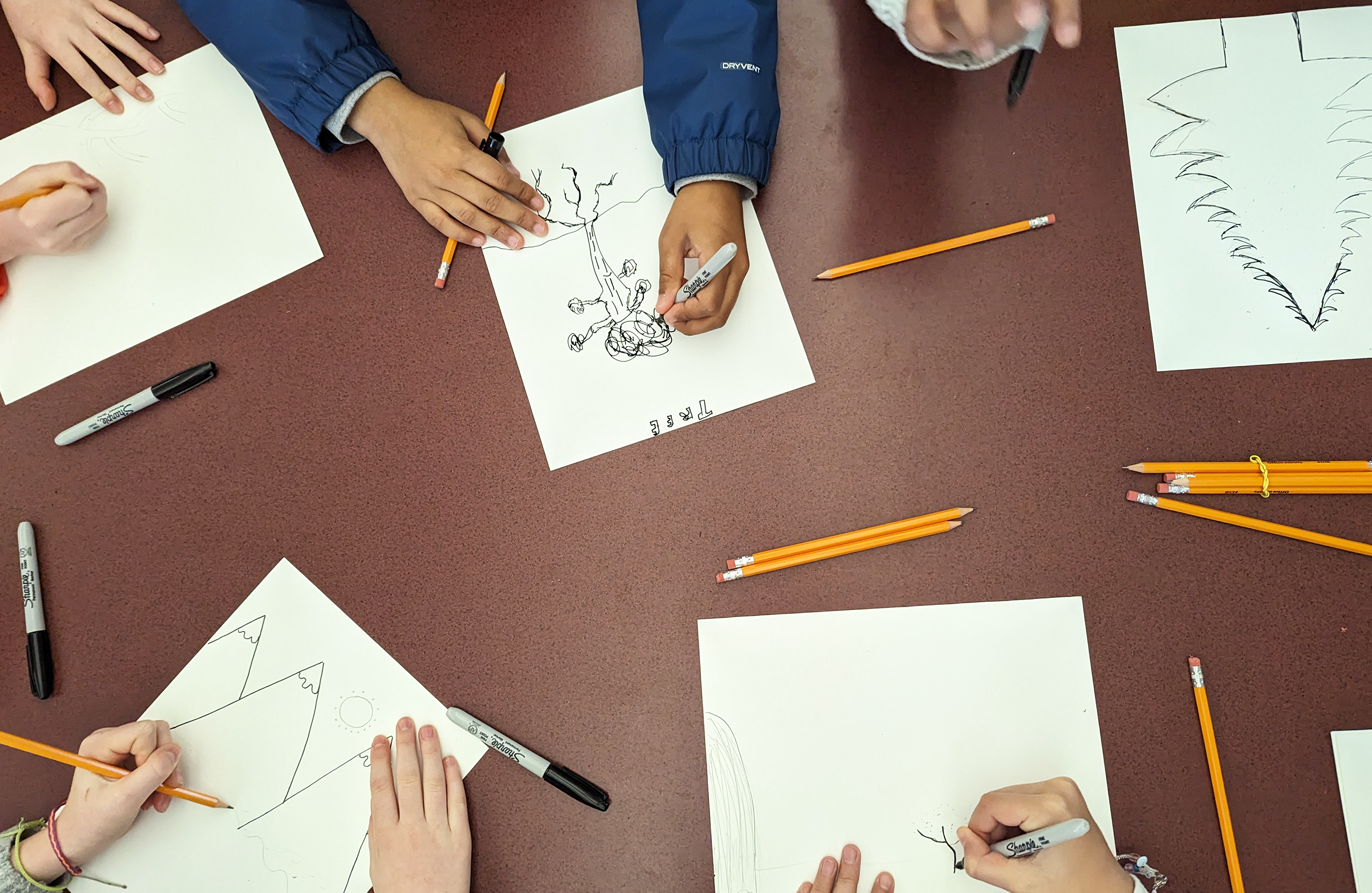
This is a collaborative project aimed at helping kids grow their curiosity about nature and their sense of belonging in the world by boosting the school’s environmental practices.
Through provocative and interactive installations at Rosa Parks Elementary School, students (K-5) are invited to explore sustainability firsthand as actual waste from their school lunches takes over the walls and fills a life-sized whale’s belly. Kids are prompted to consider: What is waste? Where does it go? What are all the ways we try to manage waste?
Ultimately, the layered data portrait of lunch waste highlights the fact that only 5% of plastic in the world is recycled. A “Reduce the Use” pledge campaign follows, led by the student leadership council. Additional activities include local clean-ups, alternative transportation to school events, and more.
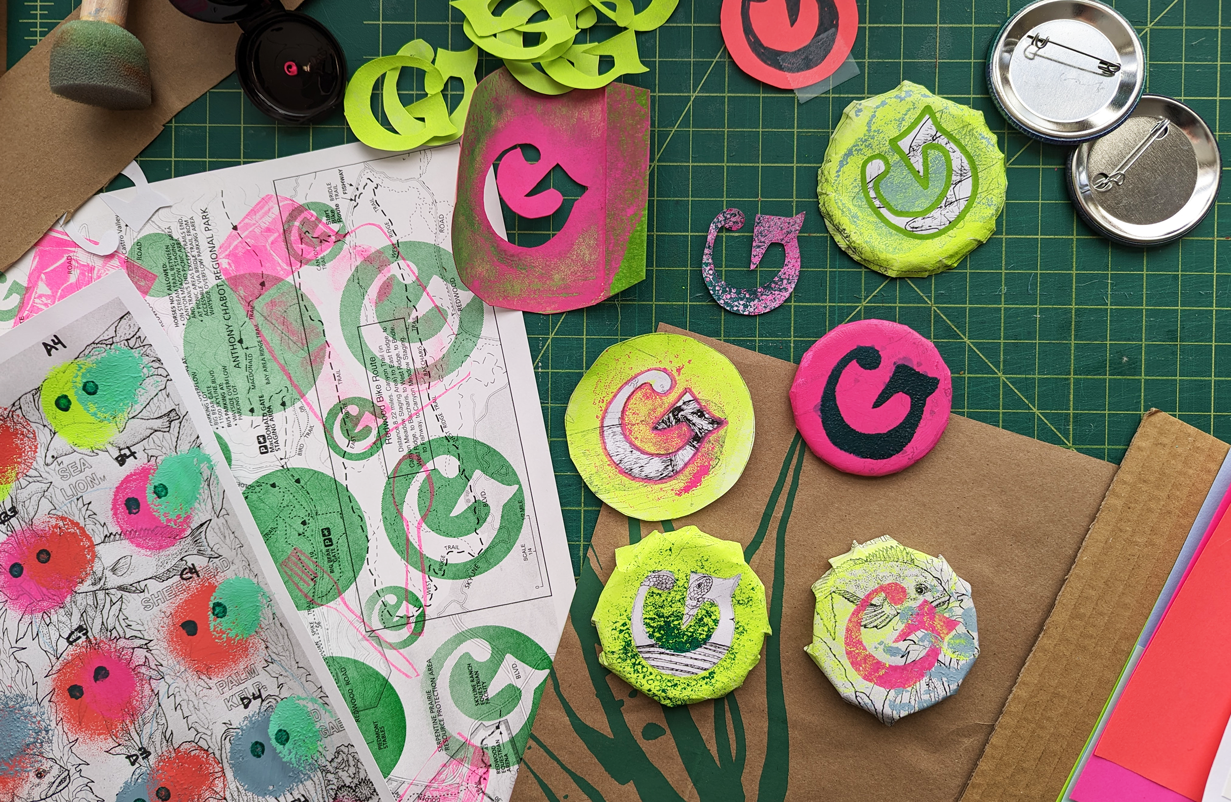
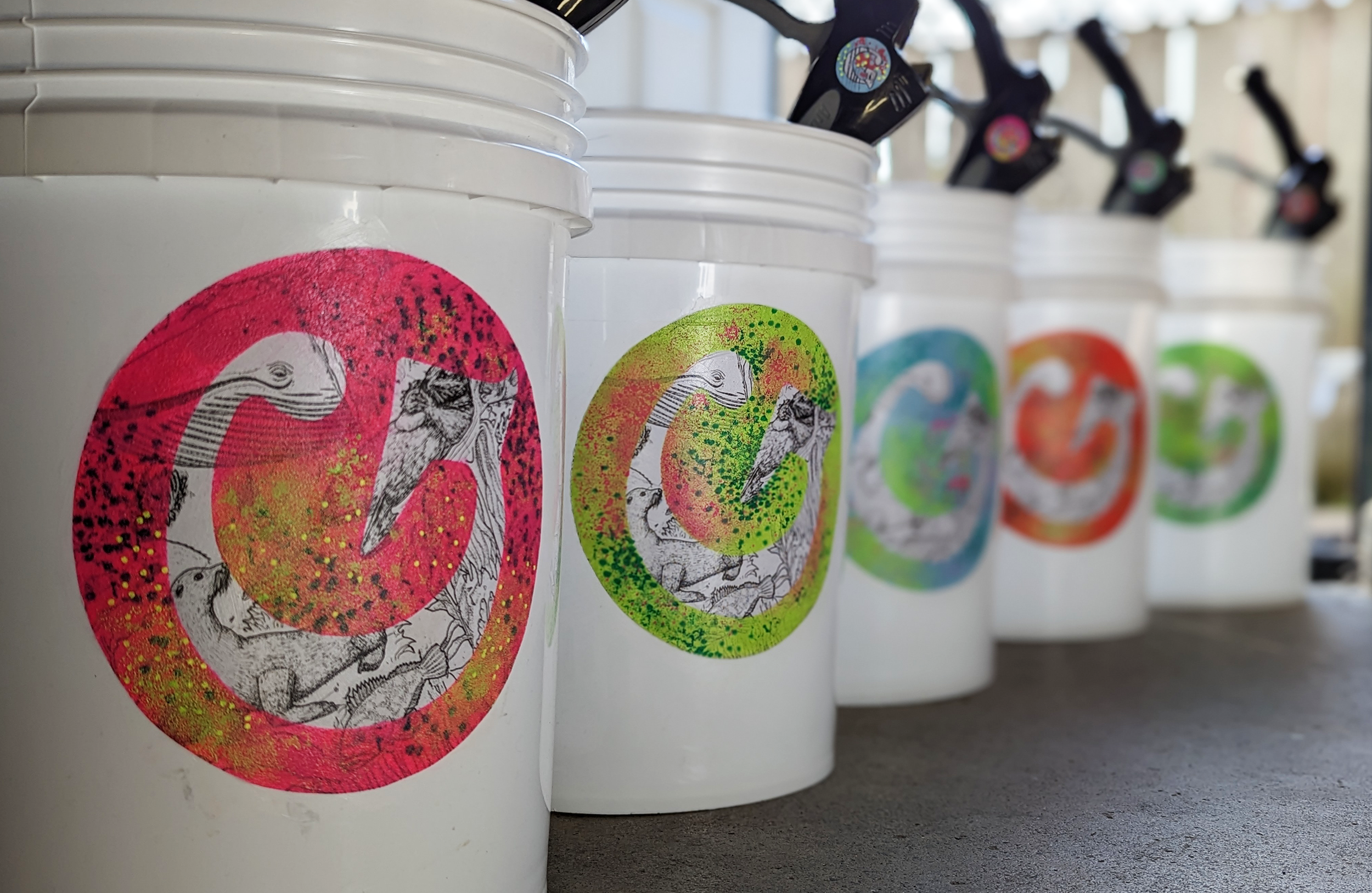
As a creative outlet, this project is an invaluable space for me to explore designing with recycled materials, developing handmade textures and dimensionality, and using color to create a recognizable system that’s not overly produced - with very little.
![]()
![]()
![]()
![]()
![]()
![]()
![]()
![]()
![]()
Green Team, project
Making sustainability more visible, touchable, and accessible for elementary school students.
This is a collaborative project aimed at helping kids grow their curiosity about nature and their sense of belonging in the world by boosting the school’s environmental practices.
Through provocative and interactive installations at Rosa Parks Elementary School, students (K-5) are invited to explore sustainability firsthand as actual waste from their school lunches takes over the walls and fills a life-sized whale’s belly. Kids are prompted to consider: What is waste? Where does it go? What are all the ways we try to manage waste?
Ultimately, the layered data portrait of lunch waste highlights the fact that only 5% of plastic in the world is recycled. A “Reduce the Use” pledge campaign follows, led by the student leadership council. Additional activities include local clean-ups, alternative transportation to school events, and more.
As a creative outlet, this project is an invaluable space for me to explore designing with recycled materials, developing handmade textures and dimensionality, and using color to create a recognizable system that’s not overly produced - with very little.


Brand strategy + Graphic design + Web design
Bay Area Children’s Theatre
A dynamic and strengthened identity for the foremost children’s theatre company in California.
As a designer and brand strategist, I uncovered patterns in the existing brand to craft a beautiful visual and written story that engages audiences in the power of shared experiences and theatre in children’s lives.
My work included conducting brand audits, stakeholder interviews, audience surveys and brand workshops, and developing design principles. From this, I established a bold, new visual language for marketing materials including advertising assets (digital and print), postcards, brochures, signage, social, and email. I also designed the strategic refresh of bactheatre.org to boost brand reputation, improve user experience and accessibility, and provide the staff with a manageable WordPress site.
The resulting cohesive and playful identity is a unique expression of BACT in a crowded performing arts landscape and a sophisticated move in children’s theater.
Communications strategy + Campaign design + Marketing research
Vision Zero SF
Raising awareness of speeding as a major cause of traffic deaths for the City and County of San Francisco.
As the creative director, I led the development and execution of the deeply strategic marketing and communications campaign aimed at nudging social behaviors - transforming research into creative concepts, outreach strategies, and actionable steps.
Our creative team at MIG worked closely with market researchers to better understand people’s perceptions of speeding. Informed by those insights, I created communications strategies for marketing channels (radio and social) and orchestrated the development of marketing collateral (print, outdoor, and online).
Key to the success of the campaign: Collaborating with partners in law enforcement, public health, and multicultural community experts to optimize messages, creative, and tactics.
Content strategy + Design research + Creative direction
Clipper website
A modern and fully-accessible website to help millions of transit riders travel the Bay Area.
I led the multi-year redesign and overhaul of the Clipper website from an outdated identity, and 70+ pages of inaccessible and redundant content to a logical and accessible online shopping experience - with personality.
As the creative director, I was the trusted point person for the public agency client and their fare collection contractor, our design and development team at MIG, and accessible technology experts.
In addition to strategic leadership and partnership building, my work included defining and conducting user testing, developing content strategy, copywriting, and guiding designers in the reshaping of the brand identity.
Creative direction + Marketing campaigns + Brand identity
Clipper brand
Repositioning the Bay Area’s all-in-one transit card for a savvy, everyday audience.
I led the evolution and refinement of Clipper’s visual identity and communications through the development and execution of multiple, award-winning campaigns and marketing collateral pieces. The evolved brand remains recognizable to millions of transit riders while appealing to future card holders.
Our creative team at MIG deliberately moved the brand away from the inaccessible perception that many people have of public transit to establish an approachable connection with commuters. The brand language draws inspiration from actual Bay Area transit riders who described the joys of smooth passage from place to place and “me” time they enjoyed on transit vs. the stressful stop-and-go traffic and exhausting grind of car commuting.
As the creative director at MIG, I worked collaboratively and cross-functionally with internal and external teams to envision creative and bring it to life across multiple applications. My work included ensuring high standards for quality and consistency of all brand expressions.
Marketing research + Communications plan + Social strategy
Family & Children’s Services
A targeted marketing and communications plan to increase foster family recruitment for teenagers.
Working closely with a multi-disciplined team of internal and external experts, I crafted a strategic and sustainable roadmap for Santa Cruz County staff, and led the creation of a social marketing campaign to effectively recruit potential caregivers.
My work included facilitating staff work sessions, stakeholder interviews, focus groups and online surveys. I defined specific strategies and actions to successfully promote the foster care program, and led the development of an “evergreen” campaign including targeted online ads and social media strategy.
The result of this collaboration is a clear communications strategy easily replicable by County staff and focused on growing long-term relationships with the community.
Interviewing + Writing
It’s All Connected, project
Engaging people in conversations about girl-identifying empowerment, environmental activism, and our senses.
This is a personal project that began with the idea of exploring interconnectedness and has evolved into taking up questions of how we face radically complex problems and real opportunities to shape our future.
Through conversations with people who know girl-identifying empowerment, and environmental activism, I’m curious about how we understand the world and what’s happening around us - and how to elevate models of living.
Brand identity + Graphic design
Data science & the environment
A visual identity for a new research center tackling environmental challenges at UC Berkeley.
To coincide with the launch of the center, I created a visual identity to stand out in the vast university space and set the tone for how stakeholders would envisage the center moving forward - as confident, trustworthy, and inclusive.
The identity needed to express the brand strategy of the Eric and Wendy Schmidt Center for Data Science and Environment (DSE) as “Creating data-enabled solutions to our most pressing environmental challenges.” It had to be relevant to research partners and encompass a wide range of topics from data science solutions for predicting wildfires to optimizing carbon capture methods, without appearing too tech-dominant or narrow.
As the designer, I selected a typeface that reflected the duality between data and the environment. The leafy accent is custom-drawn from the overlapping counters of the logo letters, underscoring the center’s potential for innovation. The color palette consists of the primary UC Berkeley blue and natural tones referencing the precious natural world and our responsibility to care for it.
Participatory art + Collaboration + Brand identity
Art of Hope, project
Encouraging artistic expression to bring people back together and nurture belonging in a time of crisis.
This is a participatory art project I created with students at Rosa Parks Elementary School during a time when schools were closed to in-person instruction and we could not be together on campus.
Students expressed their feelings through personal art and words. And I assembled their handmade drawings and statements of hope into a giant, on-site display of art kites - symbolic of a new beginning together.
Art for Hope attracted much positive attention in the neighborhood. Yet, the most hopeful part were the students and families who visited the exhibit and brought smiles back to the school.
Brand identity + Typography
Play On!
A visual style for interactive kits that bring the magic of theater into the home.
As the graphic designer, I worked closely with the creative team at Bay Area Children’s Theater to develop a consistent look and feel for their story-based, audio musical kits.
Play On! kits are a unique creative experience that inspires kids to role-play through stories and shape the plot’s outcome. Fun, thought-provoking, and highly engaging, the audio musical kits are packed with catchy tunes, engaging adventures, and imaginative games that get kids moving.
My work included producing the printed kit materials from concept to completion with an emphasis on color, composition, and typography. I created consistency and style guidance to increase readability and credibility of the product.

